Stencil troubleshooting
How to fix tattoo stencil lines that look too light
Find the stage where contrast is being lost before raising every setting. A faint preview, pale print, and weak skin transfer need different corrections.
Identify where the line becomes faint
Check the workflow in order: the digital stencil, the printed sheet, then the transferred mark. If the line is already pale on screen, adjust the image. If the file looks strong but the paper is weak, inspect the printer path. If the print is clear but the transfer is faint, look at paper handling and application rather than making the digital line excessively heavy.
A fast diagnostic
- Zoom out and judge the complete digital stencil at the intended size.
- Export the file and confirm that the saved PNG matches the preview.
- Print a small known-good test shape beside the current design.
- Compare the printed line with the final transferred line.
- Change one stage at a time, then repeat the same test.
If the digital outline is too light
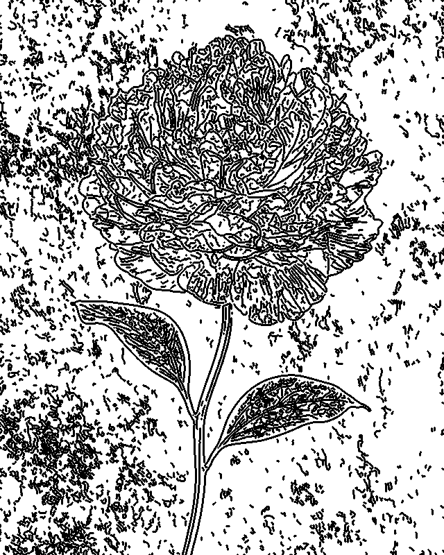
Start with crop and exposure. Extra background texture can consume the converter's attention, while a low-contrast subject may not have enough separation to produce decisive contours. Crop close to the subject, then adjust exposure until the important boundaries read clearly.
Next, control detail. Raising detail can recover missing folds, facial structure, fur direction, or lettering, but it can also bring back low-value texture. Use ink strength after the important contours are present. It should make selected lines more printable, not replace missing structure with a dark blur.

If the printed stencil is too light
Confirm that the exported file contains solid dark marks rather than translucent gray lines. Then test the printer with a known-good file. Battery state, heat behavior, feed direction, carrier sheets, paper compatibility, and maintenance can change output even when the PNG is correct.
Avoid solving every printer problem by turning the whole image black. Excessive digital ink strength can close small gaps and join nearby contours. Make the smallest necessary image adjustment, then test the hardware path separately.
If the transfer is too light
A strong print can still produce a weak transfer. Check that the correct layers of the transfer paper are loaded in the intended order and that the printed sheet has not shifted. Follow the paper and transfer product instructions for preparation, contact, and removal timing. Use the same small test design so you can tell whether a change improves the result.
Protect the detail that still matters
The goal is not maximum darkness everywhere. The goal is readable hierarchy. Outer contours, major interior divisions, and placement marks usually need the strongest treatment. Fine texture can remain lighter or be removed when it would merge at the final size. Review the result near transfer size before committing to a full sheet.